1970s Interior Design Ideas for Home Decor. Nevertheless, the 1970s was a rather esthetically influential decade, notorious for its playfulness and carefree, cheesy style. Even though it is still considered a totally tasteless time today, it has had a revival in the mid-90s and is becoming increasingly important for architects and interior designers.
Also Read: Most Popular 1960s interior design Ideas
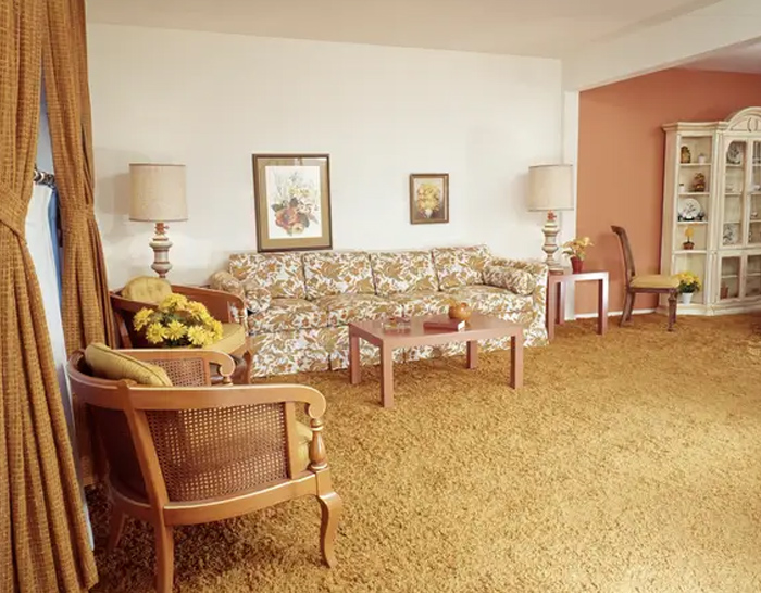
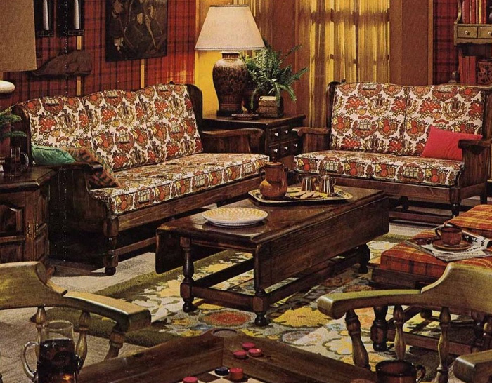
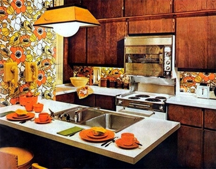
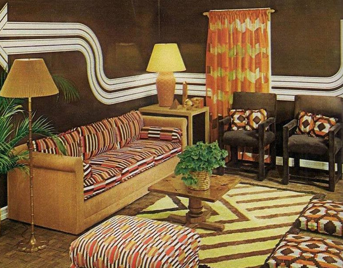
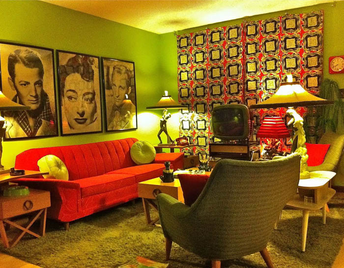
Among all the cheerful colours, patterns, macramé, and kitschy shag carpets, the 70s home decor has plenty of fun and trendy ideas that can embellish your room and add a chic final touch. This noisy, age-old disco wonderland has far more in common with the contemporary world than is instantly apparent.
1970s Interior Design
Throughout the time as well a total disenchantment with capitalism and neoliberalism was widespread. Interior architecture expressed interest in self-awareness, Eastern philosophical teachings, and a fresh appreciation of nature – all of which can be recognized in western culture. Global travel had become much more available at the time, and the evolving technologies offered many new gadgets and toys for the homes.
Also Read: Most Popular 1920s Interior Design Ideas
Home Decor of the 1970s
As much as today’s fashion comes from a smooth minimalist style, the seventies came out of the streamlined fifties and the modernism of the sixties spiced up with high-tech futurism and surreal excess, all of which later transformed into a forum for punk.
Also Read: 80s interior design ideas for home decor
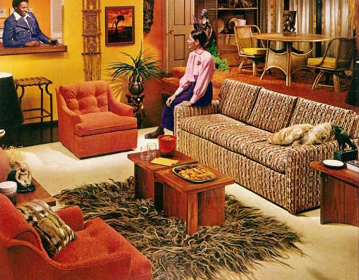
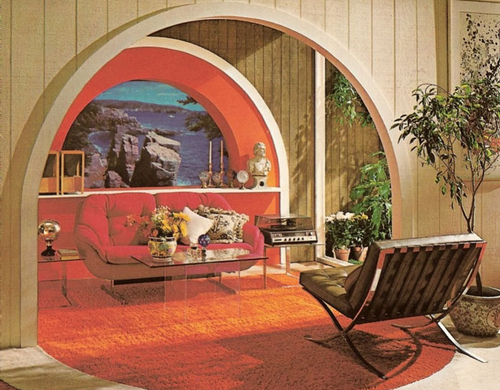
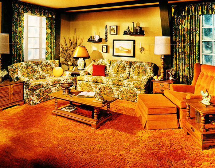
This can be seen in the dominant architecture that recognizes living spaces as organisms that are part of their surroundings’ larger network. The use of wood materials was common, mostly furniture from pine or teak wood, as well as a lot of stone. House plants and their urban oasis or indoor gardens were also a trademark of the 1970s.
70s Interior Design
Common colors were earthy tones juxtaposed with bright and vivid colors like yellow, green, brown, red, turquoise, and lots of oranges. They used black and white for backgrounds or as a counterbalance to bright tones.